
Power BI dashboard development in Trichy your team opens on Monday morning
Dashboards built on a proper data model, so two reports never disagree about last month's revenue and nobody exports to Excel to check.
What Power BI dashboard development is
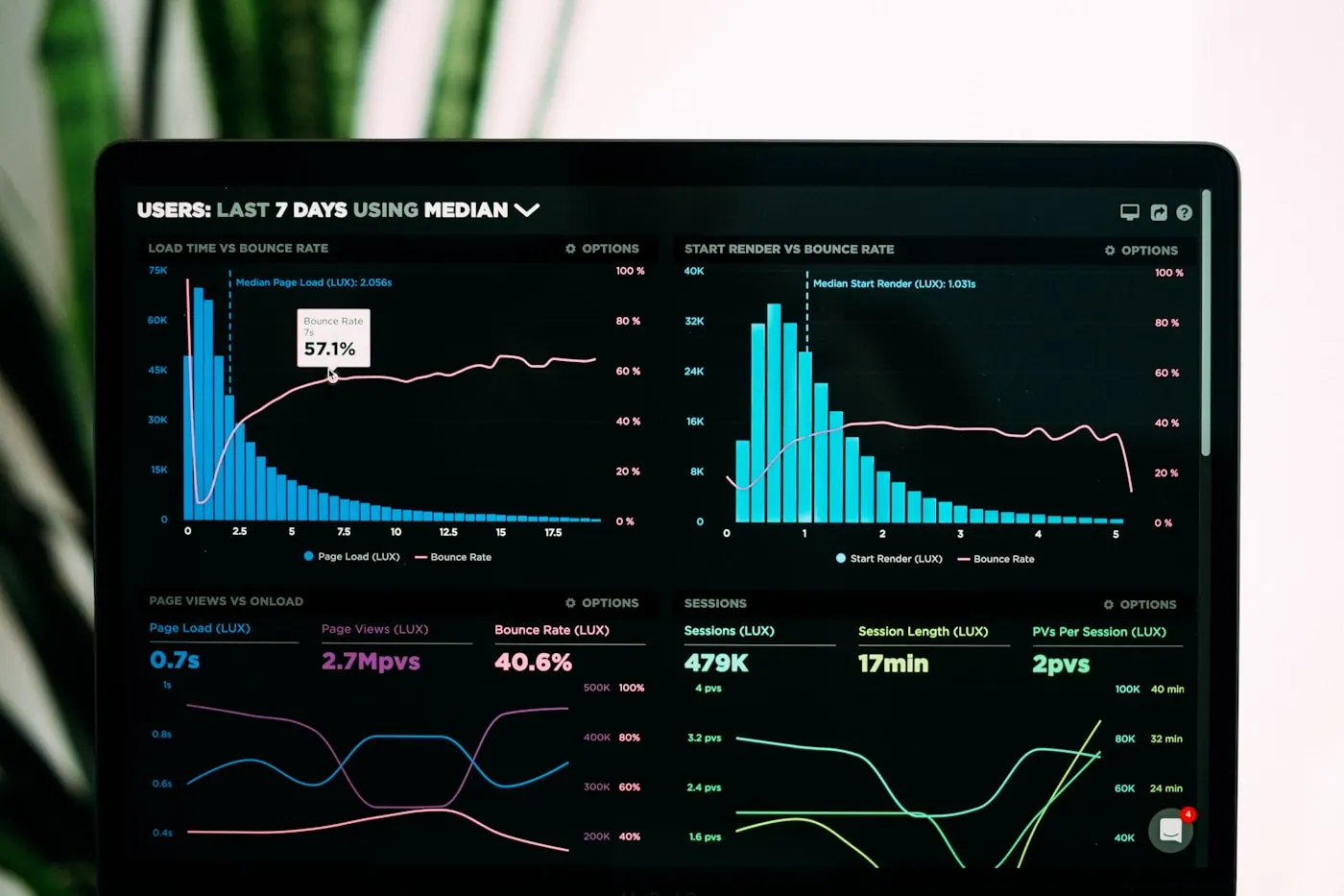
Power BI dashboard development is the work of turning scattered business data into reports people can act on. It covers connecting the source systems, modelling the data so measures are consistent, designing the visuals around real decisions, and setting up scheduled refresh and access control.
The common failure is a dashboard built directly on top of raw exports. It looks right in the demo, then somebody notices sales in one tile does not match sales in another, and within a month the whole thing is treated as decorative. The problem is almost never the visuals — it is that the same word was defined twice, in two queries, by two people.
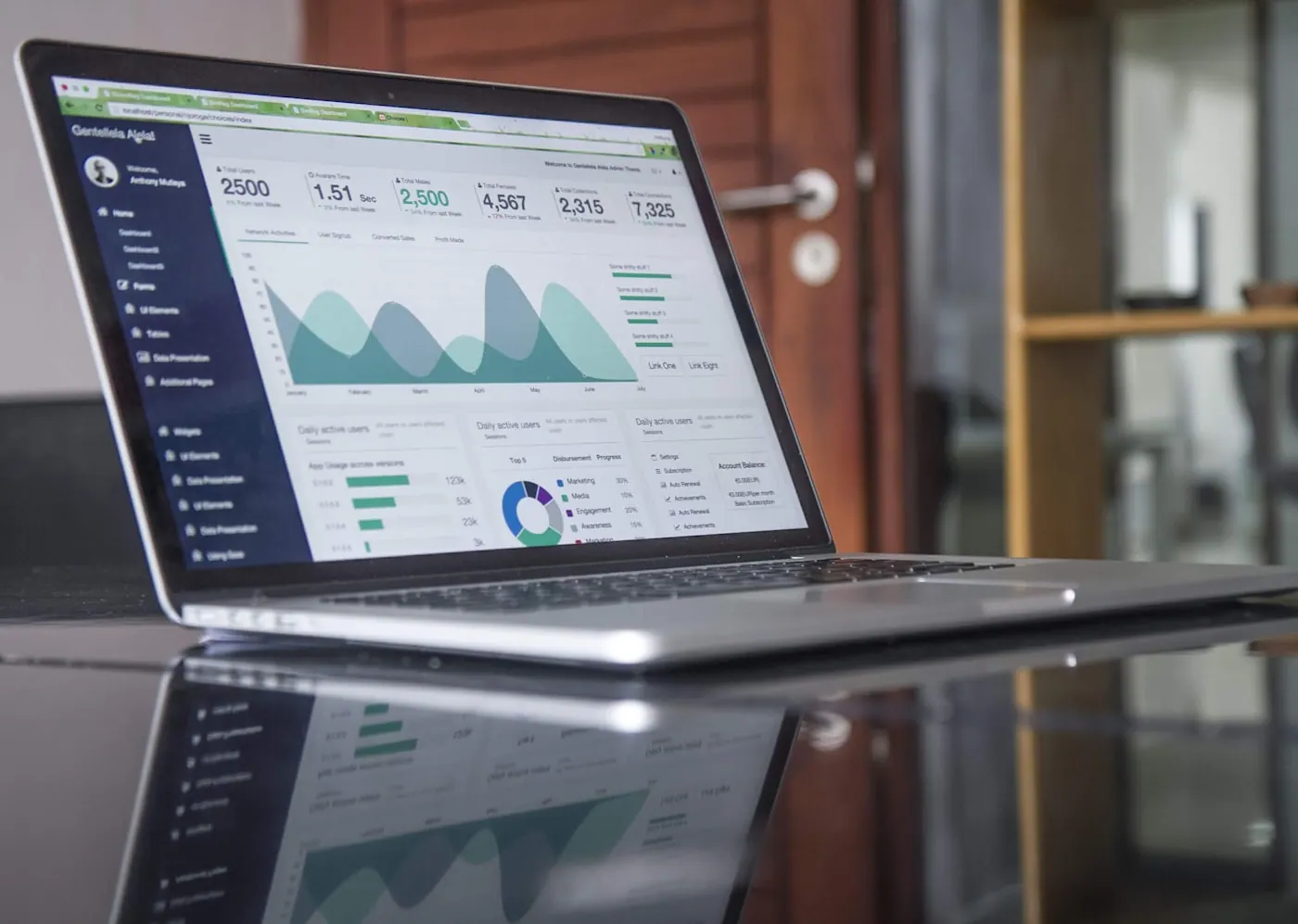
A dashboard worth trusting sits on a modelled layer where each measure is defined once. Revenue means one thing. A customer is counted one way. When two tiles disagree, it is because they are genuinely measuring different things, and the model can show you why. That is the work that makes a report survive its second month.
What's included
Source connection
Your ERP, CRM, accounting system, spreadsheets and any database, connected with refresh that runs on a schedule rather than when somebody remembers.
Data model
A star-schema model with relationships and measures defined once in DAX, so every visual that says revenue is reading the same definition.
Dashboard design
Built backwards from the decisions it supports. Every tile answers a question somebody named, and anything that does not is left out.
Row-level security
Access rules so a branch manager sees their branch and the finance lead sees everything, from one published report rather than five copies.
Scheduled refresh and alerts
Automatic refresh with failure notification, plus threshold alerts so people are told when a number moves rather than having to check.
Handover and training
A session with the people who will use it, and documentation of what each measure means, so the report outlives whoever commissioned it.
The process, step by step
- 01
Decision mapping
We start with the decisions, not the data: what gets decided weekly, who decides it, and what they currently open a spreadsheet to find out. Dashboards built from this list get used; dashboards built from an available-columns list do not.
- 02
Source audit
We look at what the data actually looks like, which is rarely what the system documentation says. Duplicate customer records, inconsistent date formats and missing categories are found here rather than after the visuals are built.
- 03
Modelling
Tables are shaped into a model with clear relationships, and measures are written once. This is the least visible and most important part of the engagement.
- 04
Build and review
Dashboards are built and reviewed with the people who will use them, in short cycles. A tile nobody looks at during review will not be looked at later either.
- 05
Deploy and secure
Published to your workspace with refresh scheduled, access rules applied and failure alerting in place.
- 06
Adoption check
We come back after a few weeks to see what is actually being opened. Usage data tells you which tiles earned their place and which were assumptions.
Who this is for
Sales and pipeline
Pipeline by stage, conversion, and retail sales by branch, product and salesperson — read from the systems the orders are actually recorded in rather than from a weekly export.
Finance and cash flow
Receivables ageing, margin by line and cash position, reconciled against the accounting system rather than re-keyed.
Inventory and operations
Stock cover, slow movers and fulfilment performance, refreshed daily so buying decisions use this week's picture.
Marketing performance
Spend, leads and cost per acquisition across channels in one view, joined to what actually closed rather than what the ad platform claims.
Manufacturing and construction
A Power BI dashboard for manufacturing ties output, scrap and machine downtime back to cost per unit. On a construction project it is budget versus actual by site, which is the report that decides whether the next stage gets approved.
Logistics, hospitals and schools
Fleet utilisation and on-time delivery for a logistics operator. Bed occupancy, theatre use and waiting times for a hospital. Attendance, fee collection and results for a school. Different sectors, one requirement: an agreed definition of the number.
How we approach it differently
- Numbers that reconcileMeasures defined once in a model, so two reports cannot quietly disagree about the same figure.
- Built from decisionsScope starts with what your team decides each week, so tiles earn their place instead of filling space.
- Refresh that does not break silentlyScheduled refresh with failure alerting, because a stale dashboard is more dangerous than no dashboard.
- Handed over properlyDocumented measures and a training session, so the report is not hostage to the person who built it.
What we build it with
Reporting
- Power BI Desktop
- Power BI Service
- Paginated reports
- Excel integration
Modelling
- DAX
- Power Query / M
- Star-schema design
- Incremental refresh
Sources
- SQL Server
- MySQL & PostgreSQL
- Tally & ERP exports
- REST APIs
- Google Sheets
Governance
- Row-level security
- Workspace roles
- Refresh monitoring
- Measure documentation
Power BI Dashboard Development across Tamil Nadu and beyond
Power BI Dashboard Development runs from our Trichy and Chennai offices for businesses across Tamil Nadu, and remotely for clients outside it.
- Tiruchirappalli (Trichy)
- Chennai
- Coimbatore
- Madurai
- Salem
- Erode
- Tirunelveli
- Thanjavur
- Vellore
- Tiruppur
- Karur
- Puducherry
Industries where power bi dashboard development does the work
Each page sets out the systems that sector runs on, the regulation it carries, and where power bi dashboard development fits into its blueprints.
Power BI Dashboard Development: common questions
Do we need Power BI licences, and which ones?
Power BI Desktop is free to build in. To share dashboards internally you need Power BI Pro per user, or a capacity licence if you have a large audience. We size this during discovery — for most small and mid-sized businesses, Pro for the handful of people who need access is the whole cost.
Can it read from Tally or our existing ERP?
Usually yes, though how cleanly depends on the system. Some expose a database or API we can connect to directly; others need a scheduled export. We check this early because it changes the refresh design more than anything else in the project.
How long does a first dashboard take?
For a single well-defined subject area with clean sources, a few weeks is typical. Most of the variance is in the data rather than the dashboard — if the source needs cleaning or several systems must be joined, modelling takes longer than building the visuals.
Should we start with one dashboard or several?
One, on the highest-value decision. It proves the data model, exposes source problems while the scope is small, and gives your team something to react to. Expanding from a working model is straightforward; unpicking five dashboards built on a bad model is not.
Why not just use Excel?
For a one-off analysis, Excel is often the right tool. The case for a dashboard is repetition and shared truth: when the same question is asked every week by several people, a modelled report removes the manual step and the version disagreement that comes with it.
What if we would rather use Looker Studio or Tableau?
The modelling work is the same and transfers. We build in Power BI most often because of Microsoft licensing that many businesses already hold, but the choice should follow your stack and budget rather than our preference.
What is Power BI used for in business?
Bringing numbers from several systems into one report people can act on — sales against target, cash position, stock cover, project margin. The value is not the chart. It is that everyone in the meeting is reading the same definition of the same figure, which is exactly what a pile of separate spreadsheets cannot give you.
What does Power BI dashboard development cost in India?
Most of the cost is in the data layer underneath, not in the dashboard. Connecting one clean source and building a report on it is a short engagement. Reconciling four systems that disagree with each other, before a single visual is drawn, is the larger project — and it is the one most businesses actually need. We quote after looking at where your numbers live, not before.
The rest of BI & Analytics Solution
Power BI Dashboards is one part of our BI & Analytics Solution practice. These are the others, and most projects use more than one.
Let's talk about your power bi dashboards project
Tell us what you are trying to achieve with power bi dashboards, and we will say honestly whether it is the right approach and what it would take.